Static mockups · same data, four layouts
Course home — design concepts
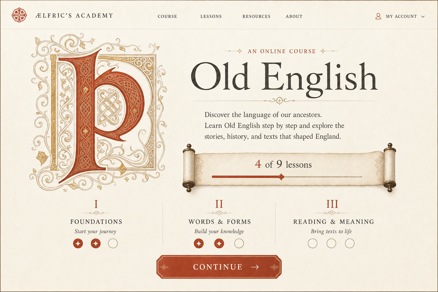
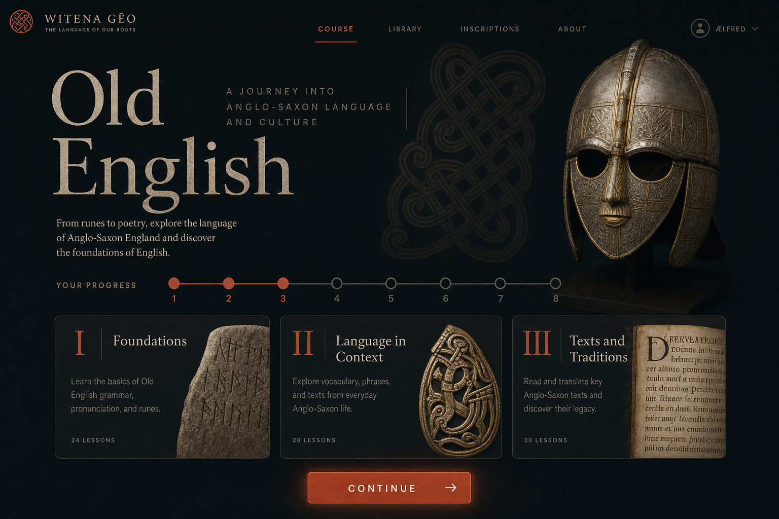
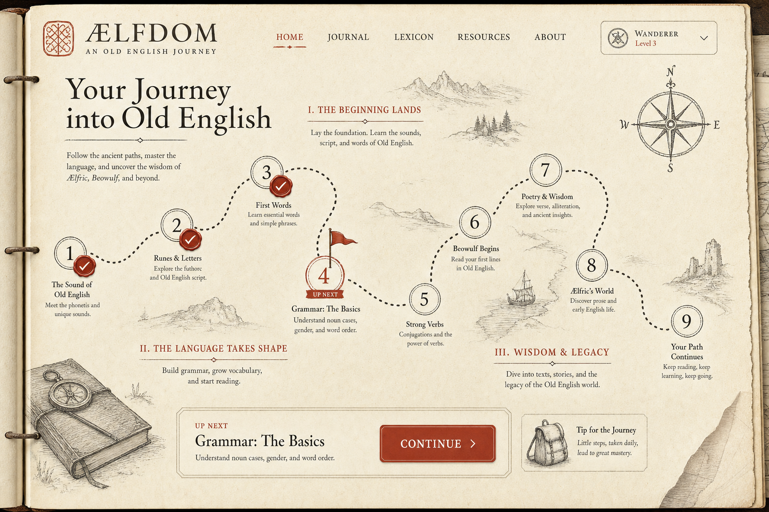
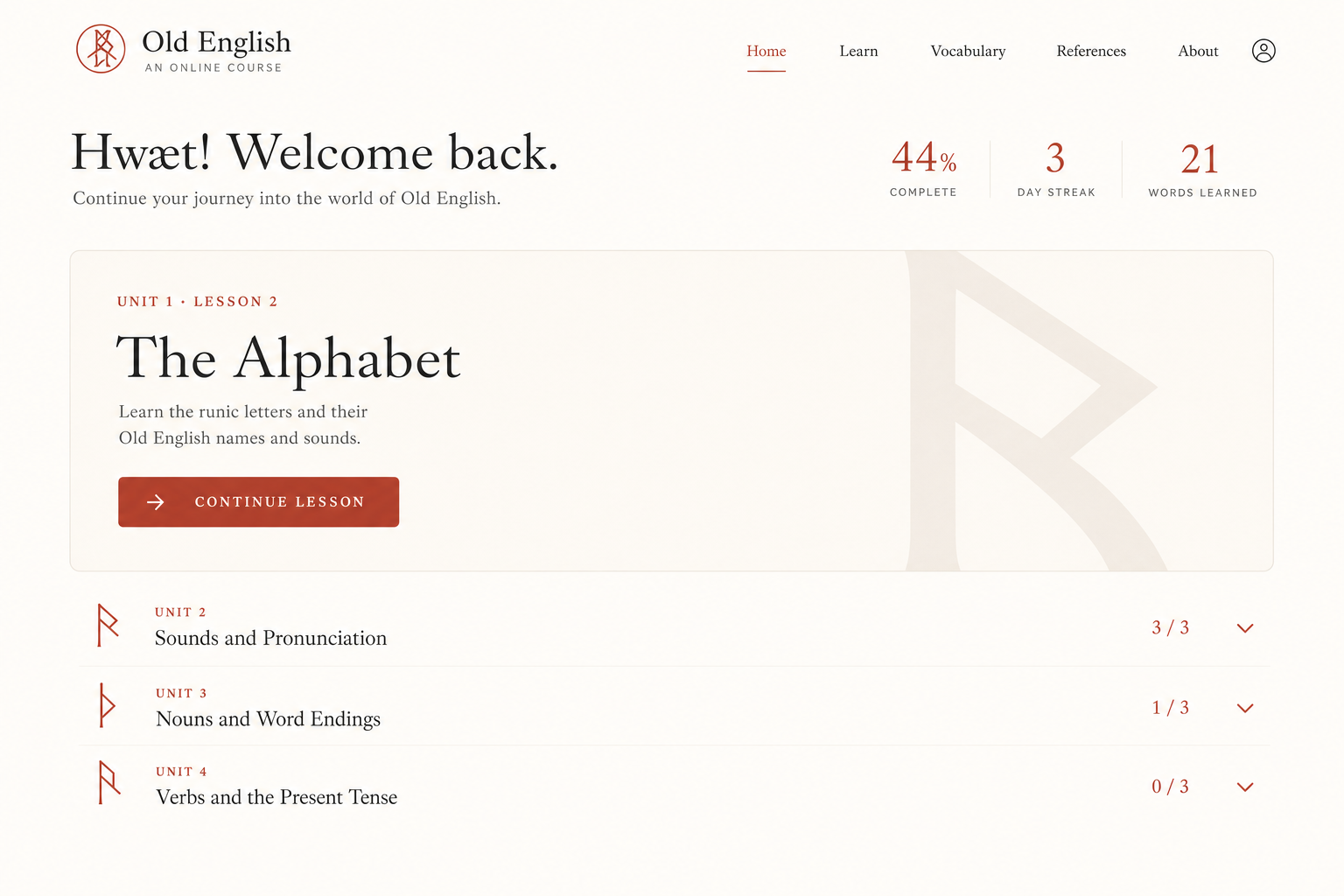
A · TextbookSidebar navigation with progress, one focused main column. The serious-reference feel of Khan Academy.A′ · Textbook, declutteredThe A layout with the four clutter sources removed: no duplication, flat sidebar, quiet markers, one accent block.A″ · The 10-unit scale testThe fear scenario, solved: ten units where only the current one is expanded — every other unit is one line. Constant-size home at any course length.B · The TrailA single vertical path of nodes — the trail is the structure. Duolingo's clarity, adult restraint.C · ManuscriptEditorial hero and three chapter cards with an illuminated-numeral feel. The scriptorium aesthetic.D · Quiet DashboardA stat band, one Continue card, light lists instead of boxes. Brilliant's whitespace-heavy calm.
All four show the Old English course mid-progress: 4 of 9 lessons done, 3-day streak, 21 words, 6 due for review, next up Unit 2 Lesson 2.
Image-model sketches
Wilder directions the static pages don't cover — mood boards, not specs (generated, so details will be imperfect).